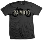
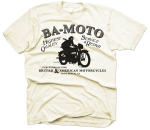
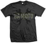
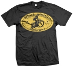
So BA MOTO got jealous…

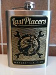
Long story short my friends at BA MOTO in Long Beach got wind of this flask I designed and etched for a friend in my club. I told them when it was their birthday I would make them a flask too. That wasn’t good enough, after a long tear-filled conversation they decided what they really wanted was shirts. Here they are! Semi works in progress… They love them. Also, the BA MOTO FLASK is in works. I design and make them by hand, so I’m still trying to figure out how a production would work. http://www.ba-moto.com, visit them now!

It’s been… too long.

To much work and fun. I decided to just make a blog roll of recent highlights.

1 and 2 are two versions of the same poster. I like the simple one better.

3 is signage for a car show event

4 is the cover for a book im laying out, also my photo! Mexico was a blast on motorcycles.

5 is a sticker

6 is a band poster… the band poster image is an image borrowed from Graphic Fairy.

Enjoy! The 2011 Womans Expo branding project will be blogged later this week.

Last Placers – New

Already redesigned the last placers logo. It’s now JUST the text. The motorcycle man is just art used with the logo some times. Looks better, the circle logo was to… to expected.

2 for 1 – Logo & Poster

It’s been a little while since I updated this section! Ill spend the next few days loading some more of my latest work into the galleries as well as an update about my award at the 2011 Photoshop World Convention in Las Vegas.
Meanwhile, look at the two latest project. A logo for a local vintage motorcycle club, and a poster for a car show in November.

Motorcycle Club Logo

New Orleans on film

Ive been working on these prints on and off for a while. I’m debating doing some 12×17 etching on brass.

here is a preview. They were shot on a toy childrens camera.

CONTINUES POSTER

For the legendary Dan Gatto of BABYLAND fame… One color, 11×17 on nice off white paper. Here is a mock up. I have plans to silk screen them myself! Updates to follow.

Silkscreen Poster Mockup

More Whole Foods Market Design

These are a set of three posters for Whole Foods Markets. I like working for them, they let me do some pretty neat stuff. It’s a nice change from the average client. I hope I get to do more of these. They are printing these in two sizes. Some large ones, and some smaller 11x17s on nice matte stock.

Thoughts?

Whole Foods Poster Set

Band Flier

It’s abstract and off music enough for me to like!

Thoughts?

Band Flier

Whole Foods poster

I designed this for Whole Foods Markets. It’s pretty cool! I worked with their art director to create this.

Thoughts?

Whole Foods poster

Nashville 2010

Car show poster. I had a few people making requests for themes, cars and colors… I really like the typography, I feel I captured vintage Nashville quite well. The car is a little cut and paste but that’s how design works with 9 people in charge. I did the best I could to please the committee. More (personal) design coming soon, I promise.

Lastly, The car has been gray scaled and hand colored, I also used a really tight half tone screen on it. The before and after is pretty dramatic, but it’s subtle when placed on the poster.

Nashville 2010